Wednesday, 9 December 2015

Bibliography

References

BlackRose,. 'Photography-Seven Photographs That Changed Fashion'. N.p., 2012. Web. 9 Dec. 2015.
calumwaterfield,. '7 Photographs That Changed Fashion'. N.p., 2014. Web. 9 Dec. 2015.
Leong, Hoi, Hoi Leong, and Hoi Leong. 'Vicki's Beauty Diary: October 2014'.Fms406leonghnewelizabethans.blogspot.co.uk. N.p., 2014. Web. 9 Dec. 2015.
Phaidon,. 'Fashion Photography: Guy Bourdin | Photography | Agenda | Phaidon'. N.p., 2015. Web. 9 Dec. 2015.
Pinterest.com,. N.p., 2015. Web. 9 Dec. 2015.
profile, View. 'Espresso Style: Rankin: Seven Photographs That Changed Fashion Photography.'. Ashleigh-chapman.blogspot.co.uk. N.p., 2010. Web. 9 Dec. 2015.

Evaluation

Overall I feel as though I was able to improve on my previous knowledge on how to use a camera. Although being behind the camera is easy for me I still struggle a lot on how to edit my images in post production. Setting up the camera and lights was one of the easiest parts for me. I understood which lighting set ups would work best for different models and different types of posing. One thing I did struggle on though was directing the model. Although I had many ideas in my head I'm not the best person at giving directions. However looking at the images that I took I am pleased with the ones that I got. Although I didn't do a whole lot of research for this particular project I was using my knowledge from my previous years at college and using the range of photographers that I knew already in hopes of them bringing some form of inspiration. Also watching the documentary that Rankin did really helped show me how working with others helps create the perfect and the sometimes you can't always do things by yourself. The hardest thing however was the post production stage. Trying to use photoshop was a real struggle as I didn't want to over edit the images but I also didn't want to under edit them as well. In the end I tried to leave the images as natural as possible.

Final Colour Images

So for my final colour images I decided to go for the high fashion images that I had looked at previously. Rather than have the hair completely slicked back I decided to tie it up in a high ponytail trying to get as much of the hair back as possible but leaving the little fly away hairs out. For this shoot I used a beauty dish and had it high up so that the light was pointing down on her. I wanted to create as much shadow as possible without making the images look unpleasing to the eye. I didn't feel as though there needed to be a lot of editing so I left the images more or less how I took them. One thing that I did think is that they were taken quite far away and aren't as close in as I thought they were.


Final Black and White Images

So for my final three black and white images I decided to try out the grungy look that I was going for. I think that the hair for this particular style worked well but maybe if I had smudged the eye liner a little more it may have turned out slightly better. For this shoot I used a soft box as I wanted the skin to look smooth. Looking back I wish I had tried with a beauty dish as it might have created some slightly harsher lines making it look more like my desired look. I tried to keep the editing as minimal as possible as I didn't want to change too much of the images. 


Colour Questions

So for our black and white shoot we decided to have a look at what different colours would look like. This is so that if we ended up putting loads of work into the makeup and then it not showing up in black and white. For example a lot of the lighter colours don't show up as well unlike the darker colours. Also a lot of colours show up as the same shade when turned into black and white. 

So looking at the colours you can see that a lot of the lighter colours such as yellow, light blue and orange they more or less have the same shade. While the three colours at the bottom also have the same shade. This will come in incredibly handy because say I didn't have a certain colour I can substitute another colour in.


Mood Board

So for Kat's lesson we were learning about how to create a mood board. I knew that mood boards helped but I never realised how important they can be. If anything were to change on the day of the shoot, changing the mood board is going to help let the other people that are working on the shoot know what has changed and what the new aim of the shoot is. So the task we were given was to open a dictionary with our eyes closed and pick a word and then create a mood board around that word. People got words like press and cocktail which would have been slightly difficult but thankfully I was able to get the word 'red'. All I had to do was flick through magazines and pick out anything that was red or had something to do with the word red. 


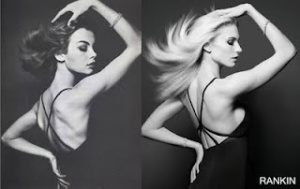
After having a practise go of doing a mood board I then decided it would be a good idea to start on my own mood board. I didn't want to have too much colour included so a lot of my images lean towards the black and white side even if they are in colour. I tried to chose different images based on poses, colours and lighting set ups. For my colour shoot I like the idea of doing something based around high fashion and having the models hair back in a high ponytail. For my colour I wanted to something a little different and have quite a grungy messed up look.

Studio time again!

Well I was back in the studio again today having another play about with the lights and seeing about different types of poses. We only ever used the beauty dish but we changed the amount of power that was used to see what the images would look like. The image in the top left corner has the correct amount of light for her face. Had it been any brighter it would have washed her out as she has naturally lightly tanned skin. The image in the middle is slightly overexposed as I look quite washed out but because I have naturally pale skin this lighting works okay for me. The image in the top right corner is slightly underexposed as it is quite dark and you can see more shadows than highlights. This image doesn't look too good as it looks quite flat.

The bottom three images all have the correct exposure but I wanted to play around with different types of poses. In all three images the models have quite a grungy look to them but it works and it makes the images look interesting. My favourite image of the three is the one in the bottom left hand corner. I think the model was really able to capture a sense of attitude and you can sense that within the image. Usually this particular angle wound't work as she is looking down at us and we are looking up her nose....but I think because of the sense of power this image has it allows it to work and to look aesthetically pleasing.


In the Studio

So for today's lesson we are working with Chris Overend who is our main lecturer for digital image. Today we were learning about the different types of light set ups and what ones work and what ones don't. We learnt about the different types of lighting tools that there were such as a softbox, beauty dish and reflectors. 

The first set of images that we took was with a softbox. This helps diffuse the light so that it helps create a soft look on the skin. It helps makes the skin look smooth and its not a harsh light at all. This particular lighting tool is probably best used when doing black and white images as it helps show of the tonal range rather well without making it look harsh.


I chose these two images to include as I felt that they showed off two different styles of images. The one on the left is staged as the model has the scarf over her face and is using her eyes to convey feelings. While the one on the right is a picture of me middway through talking. I look at lot more relaxed in the photo as I wasn't prepared for the image to be taken.


The next set of images that we took we used a beauty dish. This is what many fashion photographers use as not only does is create a soft look on the face it is also quite a bright light allowing us to see any shadows and highlights that might not be seen when using a softbox. I chose this image as I felt that it showed the difference to the first two as it looks a lot brighter. We also tried to switch up some of the poses so we got two of us in front of the camera to see how well it would turn out. I like the image but when it came to taking the photo it was a lot harder than it seems as you have to work with your partner to make sure that the image is aesthetically pleasing.


The last lighting set up that we used was a smaller version of the beauty dish. It creates a spotlight almost over the model and we soon realised that only a certain handful of people would look okay under this light. Having the light above you creates unnecessary shadows and can make people look a little distorted. However this particular light works well with men as the shadows work well with their facial structure.

We used Chris as an example. Because of the way the lighting is placed and the way he is facing, its creating a shadow underneath his nose and jaw. This creates a strong jaw line allowing the image to have a sense of power. I was one of the lucky few that was also able to get away with this kind of lighting as I have quite high cheekbones and an angled jaw line so the shadows also work well for my face.

7 Famous Photos

So today in Kat's lesson we watched a documentary called '7 Photographs that changed Fashion'. Now again I'd seen this documentary while I was in college but I was more than happy to watch again as I love seeing a modern day photographer recreating images taken years ago. A guy called Rankin decided to choose 7 photographs that he thought changed fashion and re create them.

Cecil Beaton

The first photographer than Rankin looked at was Cecil Beaton. Beaton was very well known for his fashion photographs that were published in magazines like Vogue and Vanity Fair. The image that Rankin decided to recreate was called 'Hat Box' which beaton created in 1930 for Vogue. I love both the original and the remake as they both have such different qualities but look so similar at the same time. The original was taken on a 10 x 8 camera which was one of the old cameras that flipped the image upside down. While Rankin tried using this camera briefly, he struggled greatly as he wasn't able to see how the image turned so he switched to a digital camera. This produced high quality images that brought out the highlights and shadows that might not have been seen with any other camera.

Erwin Blumenfeld 
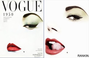
The next photographer that Rankin looked at was Erwin Blumenfeld. With the help of Cecil Beaton, Blumenfeld was able to get a place at French Vogue and then eventually moved on to American Vogue, Harpar's Bazaar and Life. The image that Rankin decided to do was one that Blumenfeld did for Vogue in the 1950's of Jean Patchett, however Rankin used Heidi Klum. The original image is so iconic as a lot of the face is missing and nothing like this had been done before and it would have been incredibly difficult to get this kind of outcome as at the time there was no such thing as photoshop so everything had to be done by hand. Unlike the modern day image where Rankin used a digital camera and photoshop to create this iconic look. The main difference between the two images is that the original looks a lot  more serious while the one that Rankin took had a little cheekiness to it making it look slightly more aesthetically pleasing.

                   
Richard Avedon
Richard Avedon was known for many of his iconic fashion images with people such as Marilyn Monroe and Twiggy. Avedon worked for magazines such as Vogue, Harper's Bazaar and Life. The image that Rankin decided to recreate was 'Dovima with the elephants'. I prefer the original image as Avedon had a tendency to photograph the model when they weren't ready creating a more relaxed mood and more authentic imagery. While the one that Rankin took it looks as though the model is a little bit scared of the elephants and doesn't really want to touch them with the way that her arms are placed. However I do think that both images are incredibly striking and have a sense of power in them.
                     [rankin_doc_03.jpg]
David Bailey
David Bailey is one of the most well known fashion photographers in history. Bailey had a way with the models and used his charisma to help bring out the more seductive side of them creating a whole other feel to them. Jean Shrimpton was one of Bailey's previous lovers and was one of the models that would constantly be seen in his images. So the image that Rankin decided to do was one that Bailey did with Shrimpton so Rankin decided to use his girlfriend Tuuli in hopes of catching that more intimate feeling. As much as I like the image that Rankin produced I prefer Bailey's one as there is better use of shadows and highlights. 
                     
Helmut Newton
Helmut newton invented his own style of fashion photography. Getting models to pose almost in the nude helped create his iconic style for photography. Newton mainly worked for the Australian version of Vogue but some of his photographs were published in the British Vogue and Harper's Bazaar. The image that Rankin chose was one that he was able to shoot so that it was incredibly similar to the original. Rankin was able to shoot in the same street as the original so the backdrop for the image was more or less the exact same. The model for this shoot was able to pick up on the attitude that the original model had and was a able to create a sense of mysteriousness. I love both images as they each have different things about them that make them so interesting.
                      [rankin_doc_06.jpg]
Guy Bourdin 
I'm not really sure how to explain Guy Bourdin's work other than seductive, unique and outright strange. Although his images weren't the norm at the time, he broke all boundaries and created images that he felt made a statement. His work was published in magazines such as Vogue and Harper's Bazaar. The image that Rankin chose to recreate was probably one of Bourdin's more conservative pieces of work, however I am not a big fan of how Rankin re made it. The original I felt was quite simplistic and having the pink background just helped add to the image, while Rankin used bright red tights, a metallic looking leotard and having the pink background just makes it look slightly odd and I wouldn't think that this was a remake of the original. 


Herb Ritts

Herb Ritts mainly focused on black and white photography and used greek sculpture as his muse. His work was published in places like Vogue, Harper's Bazaar, Glamour, GQ and Vanity Fair. He also work with many different fashion companies like Georgio Armani, Lacoste, Calvin Klein, Chanel and Ralph Lauren. The image that Rankin chose to recreate was called 'Fred with tyres'. I love both of these images as I prefer working in black and white as I feel that you are able to see the range of tones better. One thing I would say is that in the original the model has a slightly more masculine shape which makes this particular image a little more modelesque? If that's even a word! Although the gorgeous David Gandy has more of a rugged look which makes the image look more authentic. 

Practise....lesson 1

So today was out first lesson for digital image with guy called Peter O'Keefe. Peter showed us the basics of the camera and how to work it. Now I did photography in college so I already knew what he was going on about, however for those that were learning it from scratch it can be a really confusing process.

So first things first, always clear previous settings so that you know for sure that if the previous user has changed some strange setting it will be cleared and you can start from scratch and create your own settings. The next thing is to change the image into RAW. This is because this is not only the best quality it also allows you to change anything within the image when it comes to editing it.

So to be able to change the settings you will need to have the camera in manual mode. If it's in automatic it will change the settings for you to suit the lighting, this can be helpful at times but if you want your image to look a certain way then it can easily cause a struggle. The next thing that you need to change is the ISO settings. It will be an auto due to you scrapping the previous setting but you'll need it to be on 100. Another setting which will need to be changed is the shutter speed, it will need to be changed from 1/400 to 1/160.

Now that you've got your camera ready I'd say you get should get snapping!!